
For me it boils down to four elements:
 1. Title
2. The overall art
3. Intrigue/mystery
4. The human touch
TITLE: In YA, one word titles are especially potent, but I’ve read that titles should be no longer than 4 words, or you start losing readers. If the title is set on fire by the background images, you’ve got gold.
THE ART: A professionally designed cover says, “I’ve got class, and what’s inside was professionally edited and has class too.” I think we can’t measure how powerfully this is believed on a subconscious level. I’ve heard it said (and I believe it,) that the cover should communicate the genre or mood by way of color scheme, and the images on the cover should help us interpret the age group the book is intended for.
 INTRIGUE: Does the cover make me think, “Ooh, I wonder what that sword has to do with the title…” The individual elements should plant curiosity in the readers mind.
THE HUMAN TOUCH: It’s proven that people are drawn to images of people. (Imagine that.) I’m no exception and it’s my personal opinion that portraying some kind of human element–a hand, a face, a body–adds a level of connection with readers.
You can get into all kinds of other elements like motion, topography, focal point, and a dozen others, but I think the key is just to get someone interested enough to crack open the book. You can NEVER undo a first impression, so it has to count.
How about you? What aspects of a cover really draw you to a book?
 Crystal Collier is a young adult author who pens dark fantasy, historical, and romance hybrids. She can be found practicing her brother-induced ninja skills while teaching children or madly typing about fantastic and impossible creatures. She has lived from coast to coast and now calls Florida home with her creative husband, three littles, and “friend” (a.k.a. the zombie locked in her closet). Secretly, she dreams of world domination and a bottomless supply of cheese. You can find her on her blog and Facebook, or follow her on Twitter.
 Her second novel, SOULLESS (book 2 in the Maiden of Time trilogy), hits the worldOctober 13, 2014!
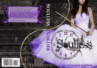
Alexia manipulated time to save the man of her dreams, and lost her best friend to red-eyed wraiths. Still grieving, she struggles to reconcile her loss with what was gained: her impending marriage. But when her wedding is destroyed by the Soulless—who then steal the only protection her people have—she’s forced to unleash her true power.


Cover art makes a big difference to me. Although I think it depends on the genre whether it needs a person or not. Although just words on the cover isn't enough for me.
I love beautiful artwork. Photos work too, but not of people unless it's non-fiction.
Beautiful and professional artwork, and yes—human touch—totally gets my attention. I agree it should hint at genre and age group. Great insights AND covers! 😉
Cover art is big, and I completely agree with the making it look professional. I agree with Alex, words aren't enough, but sometimes a person isn't necessary (see military Sci Fi, for instance).
I never thought much about cover art until I started writing and reading the blogs of writers. Since then, I have seen some amazing covers that really make me want to read the story. On the flip side, I have seen some less than stellar covers that make me think that they should have rethought it. AND, I find myself less drawn to the book. So, yes, we are visual people and the cover is important.
I think the Soulless cover is gorgeous. The Moonless cover is really nice and I liked it well enough, but the Soulless cover is a knock out winner. Well done!!!
Cover art does make a difference. As a reader, I am drawn to beautiful books, especially if I've never heard anything about the book in question. I LOVE Crystal's cover art! She and her designer did a great job putting it together. And you're right, it does scream professionalism AND class!! 🙂
I think an important aspect is for it to attract a potential reader is that the cover works both as a full size and a thumbnail. It can be a difficult balance to achieve. Color, titlework and cover art working in both sizes can be tricky.
Yeah the sword definitely pulled me in. 🙂 Nice recap of cover elements and a great intro to Crystal!
Agreed. It's definitely different depending on the genre. Still, I like the human element to make it more personal.
Non-fiction is definitely it's own thing, eh?
Thanks.
Yeah, I've seen plenty of “symbol” books that caught my attention, but there's definitely a psychological reaction to the human element.
Aw, thanks, Robin.
*blushing* You're too nice, Kristin.
Terry, completely agreed. There are definitely some great cover concepts that translate poorly to different sizes. I took a whole evening long workshop on the most important aspects of covers, and we make a thorough examination of covers, converting them to black and white to see how well they translated to newsprint, and shrinking or blowing them up. Very important aspects.
*waves* Hi, Nicole! Glad you liked the sword.
Great post! I agree with you about all the elements. I like using people on the cover too. I'm most drawn to covers with a person or people on it.
The colors usually draw me in; if there are too many then it makes the cover look too “busy”. The title draws me in too; I've bought more than one book just because the title looked interesting.
There is so much to making the cover and story come together. That's a whole other art form.
Both of those covers are INCREDIBLE. Not to mention how awesome of a story Moonless is. I can't wait for Soulless, seriously!!
Love these covers, and yes, a one-line tagline is very effective as a marketing tool.
I think you're right in your analysis of what makes a great cover – although there are always exceptions to any rules. Eg 'The 100 Year Old Man Who Climbed Out the Window and Disappeared' is a great title!
That is a great cover. CONGRATS to Crystal!
Hello! Great post and covers. I agree about the human touch. Beautiful artwork on a cover is a huge attraction for me, but a clever illusion and font can be interesting too. So much for not judging a book by it's cover.
I second your list. And for me, the emotion the cover elicits is important, too. Great post!
Hi, Misha. *waves*
Brilliant blog post, and spot on about book covers. Thanks for sharing!
Ellie Garratt
I agree with the list, though I think the human element isn't quite as important to me. But I do judge books by their covers! 🙂
Good advice, Crystal. Personally, I like to see a person or face on a cover. Makes me feel some kind of connection.